Google Photos Unveils Gradient Icon Redesign Reflecting AI Evolution
Google Photos has introduced a refreshed icon design in its latest version 7.55 update, now available on both Android and iOS platforms. This update features a subtle gradient effect that begins at the center of the icon, radiating outward to the traditional Google colors. The iconic rounded semi-circle pinwheel shape remains unchanged, but the new gradient adds a modern touch that symbolizes the surge of AI-driven innovation within Google.
The gradient effect is subtle, with the center appearing slightly lighter, especially in the yellow segment. This design choice evokes a sense of nostalgia, reminiscent of faded photographs, while also aligning with Google’s broader aesthetic updates across its suite of applications.
This icon redesign is part of a broader trend within Google to update its visual identity to reflect advancements in artificial intelligence. Earlier this year, Google updated its ‘G’ icon for the first time in a decade, introducing a gradient that transitions between the company’s signature colors. Similarly, the Gemini app received a new icon featuring a four-color sparkle design, aligning it more closely with Google’s primary brand.
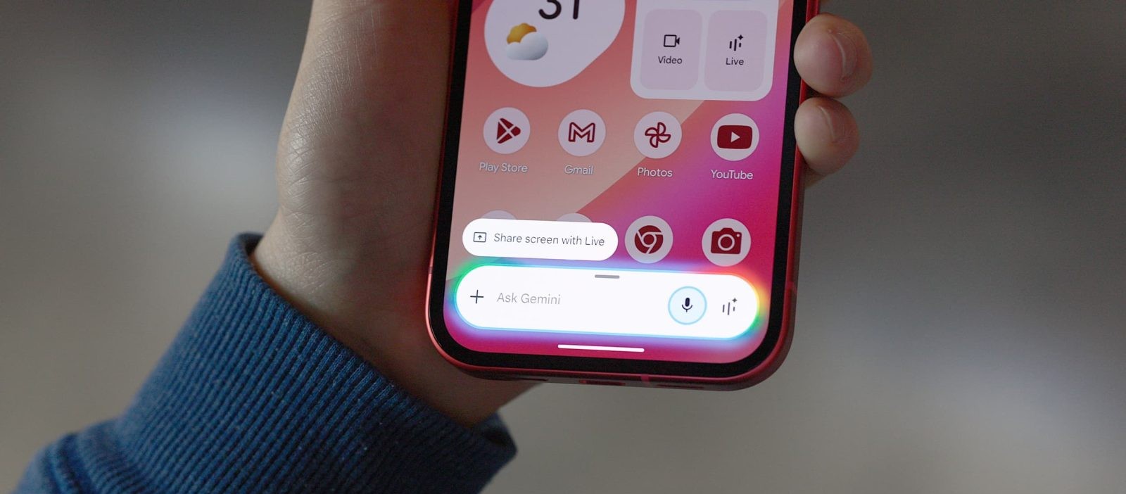
The new Google Photos icon is now prominently displayed on the homescreen and in the top-left corner of the app bar. This update coincides with the rollout of several AI-powered features within Google Photos, including the conversational Help me edit tool, Nano Banana, Ask Photos search, and Remix. These enhancements aim to provide users with more intuitive and powerful tools for managing and editing their photo libraries.
Users can experience the new icon and features by updating to Google Photos version 7.55, now widely available on the Google Play Store and the Apple App Store.