Google’s Font Evolution Culminates in Open-Sourced Google Sans Flex
In a significant move to enhance digital typography, Google has open-sourced its Google Sans and Google Sans Flex fonts, marking a pivotal moment in the company’s design evolution. This development not only underscores Google’s commitment to design excellence but also offers designers and developers worldwide access to a versatile and expansive typeface family.
The Genesis: Product Sans
The journey began in 2015 with the redesign of Google’s logo, leading to the creation of Product Sans. This typeface was crafted to update numerous product lockups—the fixed arrangements of the logo paired with product names commonly seen in the top-left corners of applications. Product Sans was characterized by its clean geometric forms, featuring repeating shapes and tightly spaced characters, making it particularly suited for prominent product names displayed at large sizes.
Transition to Google Sans
As Google’s Marketing and Product teams sought a typeface suitable for advertising and user interfaces, Product Sans revealed certain limitations. It lacked the immediate visual impact necessary for quick consumer engagement and was less effective for extended text passages or smaller text sizes on mobile devices. To address these challenges, Google Sans was developed in collaboration with Colophon Foundry. This new typeface optimized character shapes, terminals, ascenders, descenders, x-heights, and stroke contrasts, aligning closely with the 2015 logo’s design principles. The result was a typeface that effectively represented the brand, allowing marketing materials to focus on product presentation without relying heavily on other branded elements.
Enhancing Readability: Google Sans Text
In 2020, to improve readability at smaller text sizes, Google introduced Google Sans Text, also developed with Colophon Foundry. This variant featured taller, more condensed, and less circular characters compared to Google Sans, with increased spacing between them to aid legibility. Numerals were designed to be less geometric, and the angled cuts on terminals were softened, resulting in a more uniform and readable experience, even at reduced sizes. Notably, Google Sans Text was designed to match the proportions of Roboto, Android’s default typeface, facilitating a smoother transition from Roboto to Google Sans Text.
Expanding Global Reach
Recognizing the need for comprehensive language support, Google embarked on an ambitious project to extend Google Sans to non-Latin scripts, including Arabic, Chinese, and Thai. This endeavor involved meticulously crafting hundreds of thousands of new glyphs across more than 20 additional writing systems. The outcome was one of the world’s largest typeface families, capable of supporting a vast array of global languages and scripts.
Specialized Variants: Google Sans Mono and Google Sans Code
To cater to specific design contexts, Google introduced Google Sans Mono in 2020, designed for editorial applications requiring fixed-width characters at medium and large text sizes. However, this variant was not ideal for coding purposes, leading to the development of Google Sans Code in 2025, in collaboration with Universal Thirst. This monospaced typeface was specifically designed to enhance code readability and is now open-sourced, serving as the default for displaying code in the Gemini app.
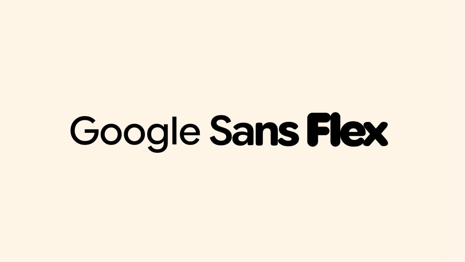
Introducing Google Sans Flex
The culmination of this typographic evolution is Google Sans Flex, developed in partnership with Font Bureau and Pathfinders. The original Google Sans did not offer the nuanced expressive range required to truly match a product’s mood or a user’s preference. In the current Material 3 Expressive era, Google Sans Flex provides granular control over six different design axes: weight, width, optical size, slant, grade, and roundedness. This flexibility allows designers to sculpt UI text with remarkable precision, enabling text to convey various tones and emotions by adjusting its attributes. For instance, designers can make text feel calm as a whisper or loud and rugged by modifying its weight, or evoke a personal, playful tone by fine-tuning its roundness. The ability to precisely adjust how rounded or soft the text appears significantly influences how readers experience and connect with a design.
Open-Sourcing for a Unified Digital Experience
By open-sourcing Google Sans and Google Sans Flex, Google aims to foster a more consistent and polished digital environment for all users. This initiative encourages developers and designers to bridge the visual gap between first-party and third-party applications, promoting a more unified experience across devices and platforms. The goal is to create clearer, more comfortable interfaces for users, enhancing their engagement with technology.
Conclusion
Google’s typographic journey from Product Sans to the open-sourcing of Google Sans Flex reflects a deep commitment to design innovation and inclusivity. By continuously evolving its typeface offerings and making them accessible to the broader community, Google not only enhances its own products but also empowers designers and developers worldwide to create more cohesive and engaging digital experiences.