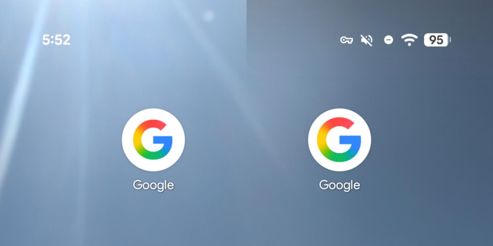
Google App Icon Enlarged in Latest Android Beta Update
In the ever-evolving landscape of digital interfaces, even the subtlest design modifications can significantly impact user experience. Google’s recent beta release of its Android app, version 17.0, exemplifies this by slightly enlarging the iconic ‘G’ logo. This adjustment aims to better fill the app’s circular icon container, enhancing visual balance and prominence on users’ home screens.
Background of the Icon’s Evolution
The journey of Google’s app icon has seen several transformations. In May 2025, the company introduced a gradient ‘G’ design, which, while modernizing the appearance, inadvertently reduced the icon’s size within its container. This led to a less impactful presence among other app icons. The current enlargement addresses this by expanding the ‘G’ to occupy more space, ensuring it stands out more effectively.
Alignment with Other Google Services
This update is part of a broader initiative to maintain consistency across Google’s suite of applications. Similar design enhancements have been observed in other services:
– Gemini App: In July 2025, the Gemini app received a new icon featuring a gradient design with Google’s signature colors, aligning it with the company’s visual identity. ([9to5google.com](https://9to5google.com/2025/07/02/new-gemini-icon-app-update/?utm_source=openai))
– Google Photos: By November 2025, Google Photos introduced a gradient redesign of its homescreen icon, reflecting the surge of AI-driven innovation within the app. ([9to5google.com](https://9to5google.com/2025/11/24/google-photos-gradient-icon-redesign/?utm_source=openai))
– Google Home: The Google Home app also underwent a visual refresh, adopting a design that resonates with the updated aesthetics of other Google services.
These cohesive design changes aim to provide users with a unified and recognizable experience across all Google platforms.
Implications for Users
For users participating in the beta program, this icon enlargement is immediately noticeable upon updating to version 17.0. Those on the stable release, currently at version 16.49, can anticipate this change in the forthcoming update, expected within the next week. Such incremental updates, though subtle, play a crucial role in refining the user interface, ensuring clarity and consistency.
Broader Context of Google’s Design Philosophy
Google’s commitment to design excellence is evident in its continuous efforts to refine visual elements across its ecosystem. The company has been proactive in implementing Material Design principles, emphasizing simplicity, functionality, and aesthetic appeal. The recent icon adjustments are a testament to this philosophy, ensuring that even the smallest details contribute to an intuitive and engaging user experience.
Looking Ahead
As Google continues to evolve its design language, users can expect further refinements that enhance usability and visual harmony. Staying updated with these changes ensures that users benefit from the latest improvements, reflecting Google’s dedication to delivering a seamless digital experience.