In August 2025, Google unveiled a significant redesign of the Fitbit app during the Pixel 10 launch event. This overhaul introduces a more intricate interface, integrating advanced features and artificial intelligence (AI) capabilities to enhance user experience.
Introduction to the Redesign
The existing Fitbit app is known for its simplicity, offering users a straightforward view of core health metrics with the option to delve deeper as needed. This user-friendly approach has been a key factor in its widespread adoption. However, the new redesign marks a departure from this simplicity, introducing a more complex interface aimed at providing comprehensive health insights.
Key Features of the New Design
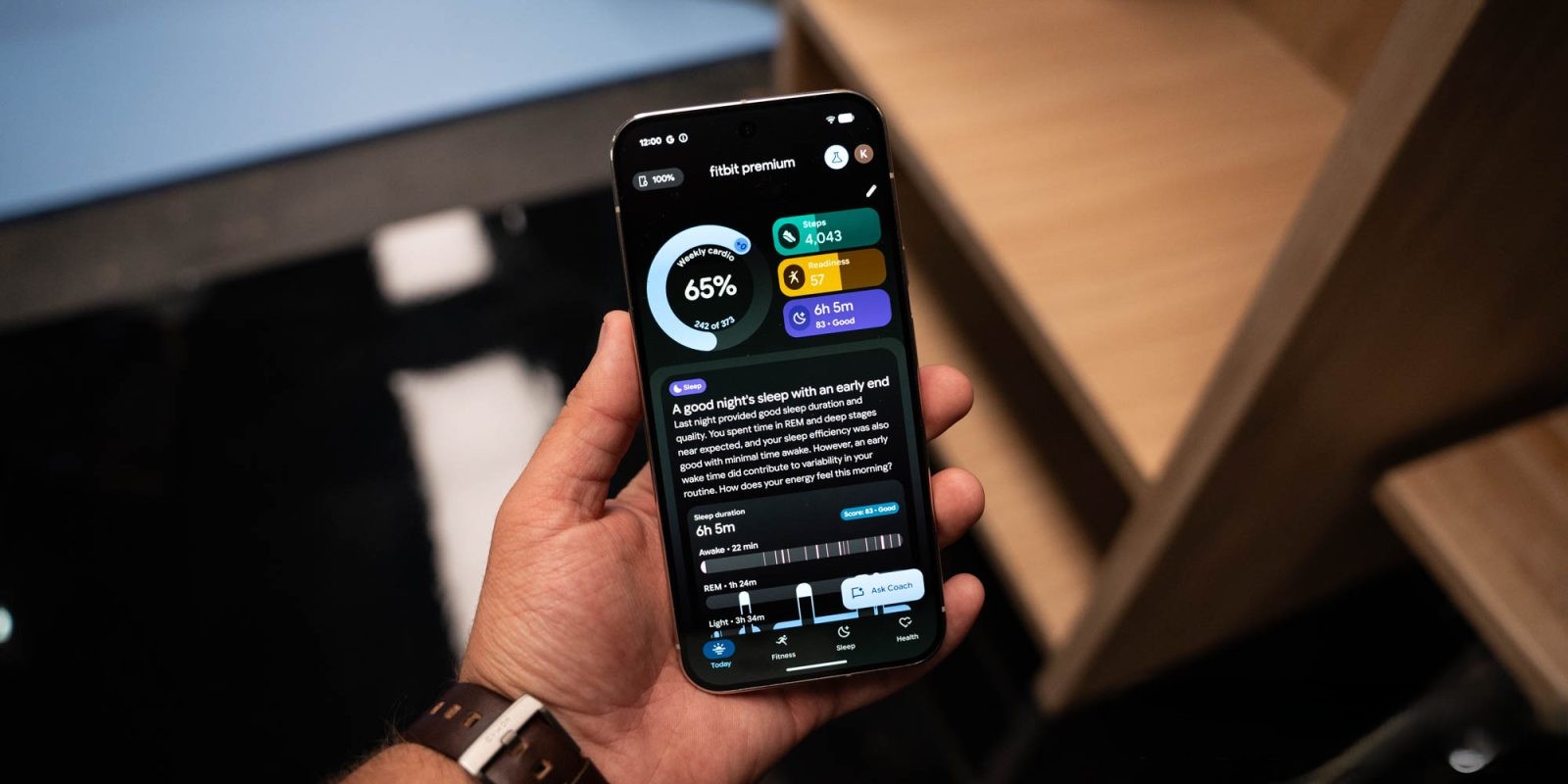
The revamped Fitbit app is structured around four primary tabs: Today, Health, Sleep, and Fitness. Each tab is designed to offer detailed information pertinent to its category.
– Today Tab: Provides an overview of daily activities and metrics, including steps taken, calories burned, and active minutes.
– Health Tab: Offers insights into overall health metrics such as heart rate variability, breathing rate, and blood oxygen levels.
– Sleep Tab: Delivers detailed analysis of sleep patterns, including duration, quality, and stages of sleep.
– Fitness Tab: Focuses on exercise routines, workout history, and personalized fitness recommendations.
A notable addition is the integration of an AI-powered coach accessible via a floating button present throughout the app. This feature allows users to ask questions and receive personalized advice based on their health data. Each health metric includes a shortcut to consult the AI coach for specific insights, aiming to provide a more tailored user experience.
User Experience and Information Density
While the new design offers a wealth of information, it has raised concerns about potential information overload. The interface displays extensive data and AI-generated insights prominently, which may be overwhelming for some users. For instance, the Today and Sleep tabs feature substantial text blocks that occupy significant screen space, potentially leading to cognitive overload.
The AI coach, while providing valuable information, can be verbose in its responses. This verbosity may deter users seeking quick answers, as they might find the detailed explanations cumbersome.
Design Evolution and User Feedback
This redesign is part of Fitbit’s ongoing efforts to modernize its app, following previous updates that introduced Material You design elements and a dark theme. Earlier iterations faced criticism for lacking features like a dark mode and tablet optimization. In response, Fitbit implemented changes such as introducing a dark theme in version 4.50 and optimizing the app for larger screens, including tablets and foldable devices.
Despite these improvements, the current redesign’s complexity has sparked discussions about balancing comprehensive data presentation with user-friendly design. Users have expressed a desire for customizable interfaces that allow them to control the amount and type of information displayed, catering to both data enthusiasts and those preferring a more streamlined experience.
Conclusion
Fitbit’s latest app redesign represents a significant shift towards a more data-intensive and AI-integrated user experience. While it offers enhanced insights and personalized coaching, it also introduces challenges related to information overload and user interface complexity. As Fitbit continues to evolve its platform, it will be crucial to address these concerns by providing customization options and ensuring that the wealth of information remains accessible and not overwhelming to users.