Apple’s Evolution: From Quirky Startup to Global Brand Icon
Apple Inc., founded in 1976 by Steve Jobs, Steve Wozniak, and Ronald Wayne, has undergone a remarkable transformation in its branding and marketing strategies over the decades. From its humble beginnings in a garage to becoming a global technology leader, Apple’s journey is a testament to the power of innovative branding.
The Genesis of Apple’s Branding
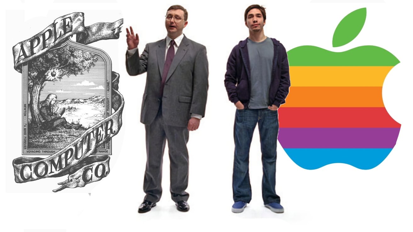
In its infancy, Apple sought to establish a unique identity in the burgeoning personal computer market. The company’s first logo, designed by co-founder Ronald Wayne, depicted Sir Isaac Newton sitting under an apple tree, symbolizing discovery and innovation. However, this intricate design was short-lived. In 1977, Steve Jobs commissioned graphic designer Rob Janoff to create a more modern and approachable logo. The result was the iconic rainbow-colored apple with a bite taken out of it. The rainbow stripes represented the Apple II’s capability to display color graphics, a significant advancement at the time. The bite was added to ensure the fruit was recognized as an apple, not mistaken for a cherry or tomato. ([applescoop.org](https://applescoop.org/story/the-history-of-apples-iconic-logo-1976-to-2023?utm_source=openai))
Design Language and Product Aesthetics
In the mid-1980s, Apple collaborated with German designer Hartmut Esslinger to develop the Snow White design language. This design philosophy introduced sleek lines, a uniform color palette, and a minimalist aesthetic that made Apple’s products stand out in a market dominated by bulky and uninspired designs. The Snow White design not only enhanced the visual appeal of Apple’s products but also reinforced the brand’s commitment to innovation and user-friendly design. ([en.wikipedia.org](https://en.wikipedia.org/wiki/Snow_White_design_language?utm_source=openai))
The Think Different Campaign
By the late 1990s, Apple faced significant challenges, including declining market share and financial instability. In response, Steve Jobs, who had returned to the company in 1997, spearheaded a rebranding effort centered around the Think Different campaign. This campaign paid homage to visionaries like Albert Einstein, Mahatma Gandhi, and Martin Luther King Jr., aligning Apple’s brand with creativity, non-conformity, and innovation. The slogan Think Different became synonymous with Apple’s identity and resonated deeply with consumers who saw themselves as part of a creative and forward-thinking community. ([en.wikipedia.org](https://en.wikipedia.org/wiki/Think_different?utm_source=openai))
Simplification and Modernization
In 1998, reflecting a shift towards simplicity and elegance, Apple transitioned from its colorful logo to a monochromatic design. This change coincided with the launch of the iMac G3, a product that emphasized sleek design and user-friendliness. The new logo’s minimalist aesthetic mirrored the company’s product design philosophy, reinforcing the brand’s image as a leader in innovation and style. ([creativebloq.com](https://www.creativebloq.com/news/apple-logo-history?utm_source=openai))
Typography and Visual Identity
Apple’s attention to detail extended to its typography. For nearly two decades, the company utilized a custom variant of the ITC Garamond typeface, known as Apple Garamond, in its marketing materials. This typeface contributed to a cohesive and recognizable brand identity. In 2001, Apple began transitioning to the Myriad typeface, reflecting a modern and clean aesthetic that aligned with the company’s evolving design language. More recently, Apple introduced the San Francisco typeface, further unifying the visual identity across its product ecosystem. ([en.wikipedia.org](https://en.wikipedia.org/wiki/Typography_of_Apple_Inc.?utm_source=openai))
Advertising Campaigns and Brand Loyalty
Apple’s advertising campaigns have played a crucial role in building and maintaining brand loyalty. The Get a Mac campaign, featuring the I’m a Mac and I’m a PC characters, humorously highlighted the advantages of Mac computers over PCs, reinforcing the brand’s image as user-friendly and innovative. These campaigns, combined with product launches that often draw large crowds and media attention, have cultivated a dedicated customer base. Apple’s ability to create a sense of community and belonging among its users has been a significant factor in its sustained success. ([en.wikipedia.org](https://en.wikipedia.org/wiki/Marketing_of_Apple_Inc.?utm_source=openai))
Conclusion
Apple’s branding journey reflects a strategic blend of design innovation, compelling storytelling, and a deep understanding of consumer psychology. From the intricate Newton logo to the sleek monochrome apple, and from the Think Different campaign to the minimalist product designs, Apple has consistently evolved its brand to stay relevant and resonate with its audience. This evolution underscores the company’s commitment to not just selling products, but to inspiring a lifestyle centered around creativity, simplicity, and innovation.