The ongoing rivalry between Android and iOS has led to a continuous exchange of design and functionality features. With the introduction of iOS 18, Apple’s Control Center has undergone significant changes, now closely resembling Android’s Quick Settings panel. Despite these similarities, Apple continues to distinguish itself by refining key elements that enhance user experience.
Design and Functionality: A Converging Path
Both Android’s Quick Settings and iOS’s Control Center are designed to provide users with swift access to essential functions such as Wi-Fi, Bluetooth, brightness adjustments, and media controls. Users on both platforms can customize the layout, rearrange toggles, and integrate third-party app functions. However, the nuances in their implementation highlight the distinct philosophies of each operating system.
Customization: Apple’s Structured Approach
Historically, Android has been lauded for its extensive customization options, allowing users to tailor their devices to their preferences. Features like grouping, resizing, and reordering controls have been staples of Android’s Quick Settings. With iOS 18, Apple has incorporated similar functionalities but with a structured and organized approach. Controls are categorized, facilitating quicker navigation and a more intuitive user experience. This method contrasts with Android’s more flexible but less curated layout.
The ability to resize controls in iOS adds a layer of personalization that was previously absent. While Android continues to offer broader customization, especially with manufacturer-specific interfaces like Samsung’s One UI, Apple’s emphasis on structured customization appeals to users seeking both flexibility and order.
Navigation and Accessibility: The User Experience
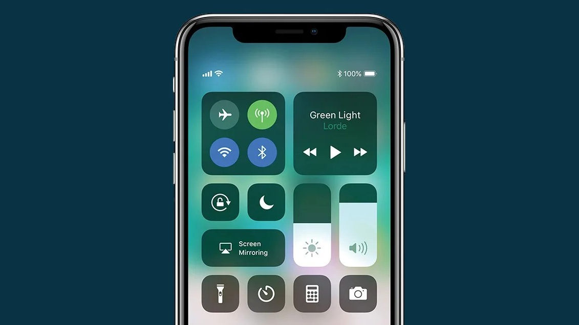
Accessing these quick panels differs between the two platforms. Android employs a straightforward swipe-down gesture, which can be performed once or twice depending on the device and settings. This method is direct and user-friendly. In contrast, iOS 18 introduces a swipe gesture from the top-right corner, which may pose challenges, particularly on larger devices.
Android’s Quick Settings also offer a shortcut to full settings within the panel, enhancing accessibility. This feature is notably absent in iOS, where users must navigate to the Settings app for more detailed configurations. Despite variations across different Android manufacturers, the core functionality of Quick Settings remains consistent, providing a reliable user experience.
The Verdict: Refinement Over Imitation
While iOS 18’s Control Center draws inspiration from Android’s Quick Settings, Apple has infused it with a level of refinement and organization that sets it apart. The structured categorization and the ability to resize controls contribute to a user-friendly interface that balances customization with simplicity.
Android’s approach offers extensive flexibility, catering to users who prefer a more hands-on customization experience. However, Apple’s method appeals to those who value a streamlined and organized interface. In the end, both platforms provide robust quick access panels, but Apple’s attention to detail and user-centric design give it a slight edge in delivering a cohesive and intuitive experience.