Android 17 Introduces Enhanced Blur Effects for a More Dynamic User Interface
In its latest iteration, Android 17, Google is set to revolutionize the user interface by integrating advanced blur effects across the system. This enhancement builds upon the Material 3 Expressive design introduced in the previous year, aiming to provide a more immersive and visually appealing experience for users.
A New Dimension to System UI
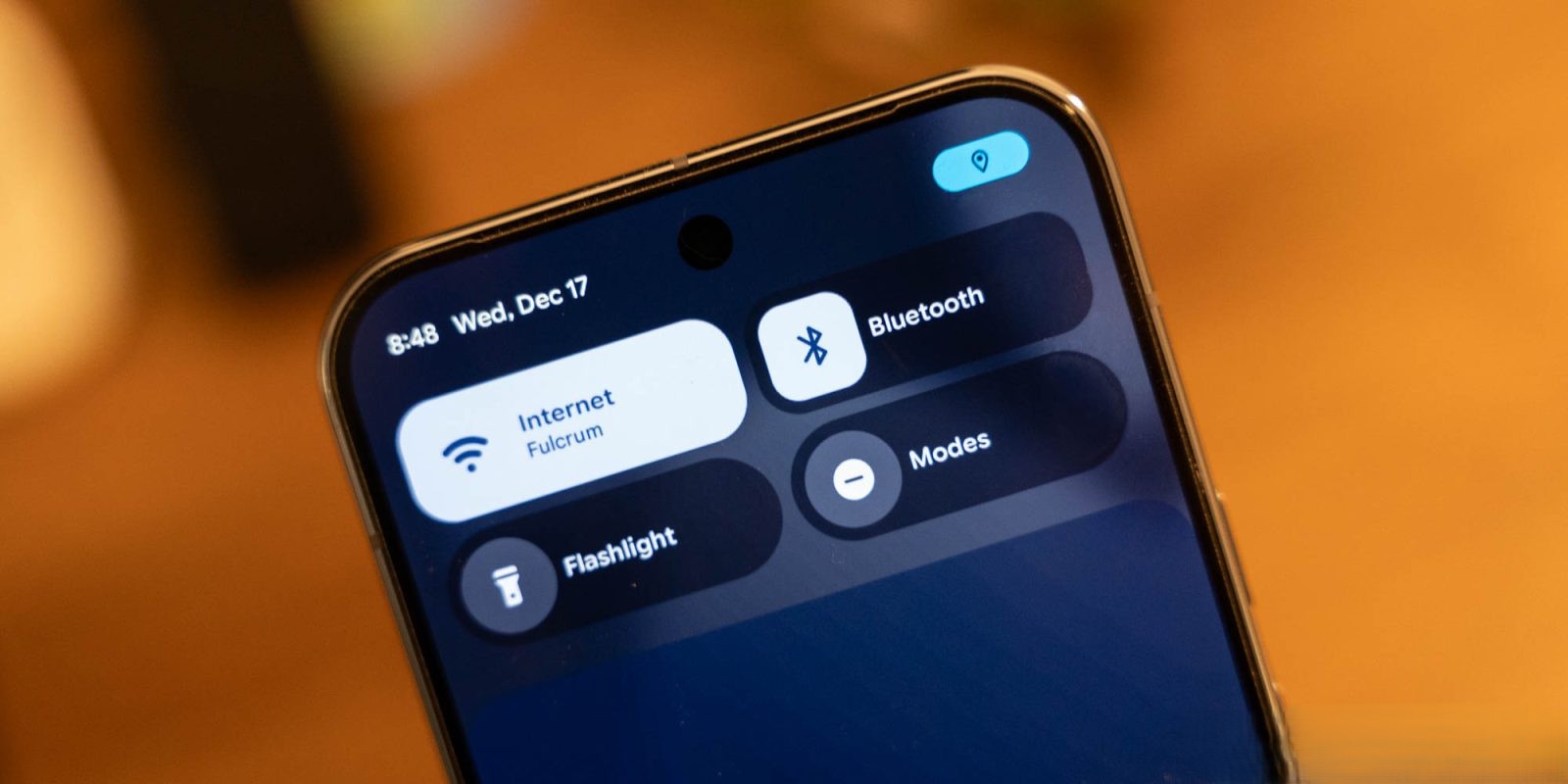
Internal builds of Android 17 reveal a significant shift from the traditional solid light or dark backgrounds to a translucent blur effect. This design choice allows users to subtly perceive the content behind active UI components, adding depth and context to interactions.
For instance, the volume control interface, traditionally a solid pill-shaped container, will now be semi-transparent. This change enables users to see their wallpaper and app icons faintly through the volume slider when on the home screen. Similarly, when adjusting the volume within an application, the underlying app content remains discernible, enhancing the sense of continuity. Other system elements, such as the full volume sheet and power menus, will also adopt this blurred aesthetic.
Dynamic Color Integration
The blur effects in Android 17 are not just static overlays; they are dynamically tinted to align with the user’s chosen color theme. This integration ensures a cohesive and personalized visual experience, maintaining the harmony of the device’s overall aesthetic.
Building on Previous Innovations
This development is a natural progression from the Android 16 QPR1 update, where Google first introduced blur effects to the notification and Quick Settings panels. At that time, Google emphasized that the subtle blurring of the shade background provided a sense of depth, making interactions feel more lightweight and allowing users to remain aware of the apps running in the background.
With Android 17, Google continues to refine this approach, offering a more nuanced and integrated blur effect throughout the system. While reminiscent of the Liquid Glass aesthetic found in iOS, Android’s implementation is more understated, aiming for subtlety over prominence.
Future Implications for App Design
Currently, these blur effects are exclusive to the operating system’s interface and are not part of the Material 3 Expressive guidelines for third-party applications. It remains to be seen whether Google will extend this design language to app developers, potentially leading to a more unified and immersive user experience across the Android ecosystem.
Conclusion
Android 17’s introduction of enhanced blur effects signifies Google’s commitment to evolving the visual dynamics of its operating system. By adding depth and subtlety to the user interface, these changes aim to create a more engaging and context-aware experience for users. As the rollout progresses, it will be interesting to observe how these design choices influence user interaction and whether they will be embraced by the broader app development community.