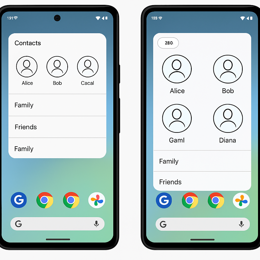
Google has begun rolling out Pixel VIPs 2.0, introducing a redesigned widget and overhauled VIP interface for Pixel phones. The update shifts the tap interaction for VIP contacts from a partial screen overlay to a full-screen layout, marking a major change in how users access contact actions like calling or messaging. Before 2.0, users would see a bottom sheet pop up after tapping a contact. Now, that same screen can be opened directly, replacing the old interaction model. This change is live following the latest Feature Drop.
New UI Elements and Layout Shifts
The VIP view has received several cosmetic and functional updates. Call, message, video, and contact buttons now use clean outline-style icons instead of filled designs. A pencil icon appears at the top right of the interface to provide fast access to editing contact details in Google Contacts. Meanwhile, content sections have been rearranged: the “Local updates” card now sits above “Last connection,” and “Notes” has been demoted toward the bottom. The media and place recommendation sections have been dropped entirely from VIPs.
Widget Redesigned + New Switcher Tool
The Pixel VIPs 2.0 widget hasn’t flipped over yet in most cases, but a preview of its redesign is visible after installing the update. The preview shows “space for quick actions,” letting users call or message VIPs directly via the widget once it’s fully active. Complementing this is a newly added pill-shaped switcher at the top that lets users flip between VIP contacts without navigating back to the homescreen.
The update is being delivered widely via the Google Play Store, enabling most Pixel users to access the changes.
What this means:The Pixel VIPs 2.0 redesign moves towards more immersive, full-screen interactions, replacing overlay panels and simplifying navigation. By focusing on quick access and trimming extraneous content, Google is streamlining how we engage with our most frequent contacts.
Why it matters:Users who rely on the VIP widget for staying in touch will notice the usability trade-off—full-screen layouts look clean but may be less friendly for one-handed use. Widgets are central to Android’s quick access philosophy, so how these changes balance convenience versus reach will determine whether people embrace the redesign.
What to watch for:Keep an eye on how responsive the new widget is once the full redesign rolls out. Will call/message actions from the widget function smoothly? Also, monitor user feedback on the full-screen VIP interface—is it fast, intuitive, or does the removal of media/place suggestions hurt context? As always, updates like this can feel small but signal broader shifts in UI philosophy.