Google is rolling out interface tweaks to its Pixel “Now Playing” feature in version 2026.08.27.x, aiming to make song identification smoother and one-handed navigation more intuitive. Key changes include a redesigned menu interface when you tap the three-dot button on a recognized track, improvements in the Favorites tab, and tweaks to spacing and icons in settings. These updates are arriving via the Google Play Store.
From Floating Menu to Bottom Sheet
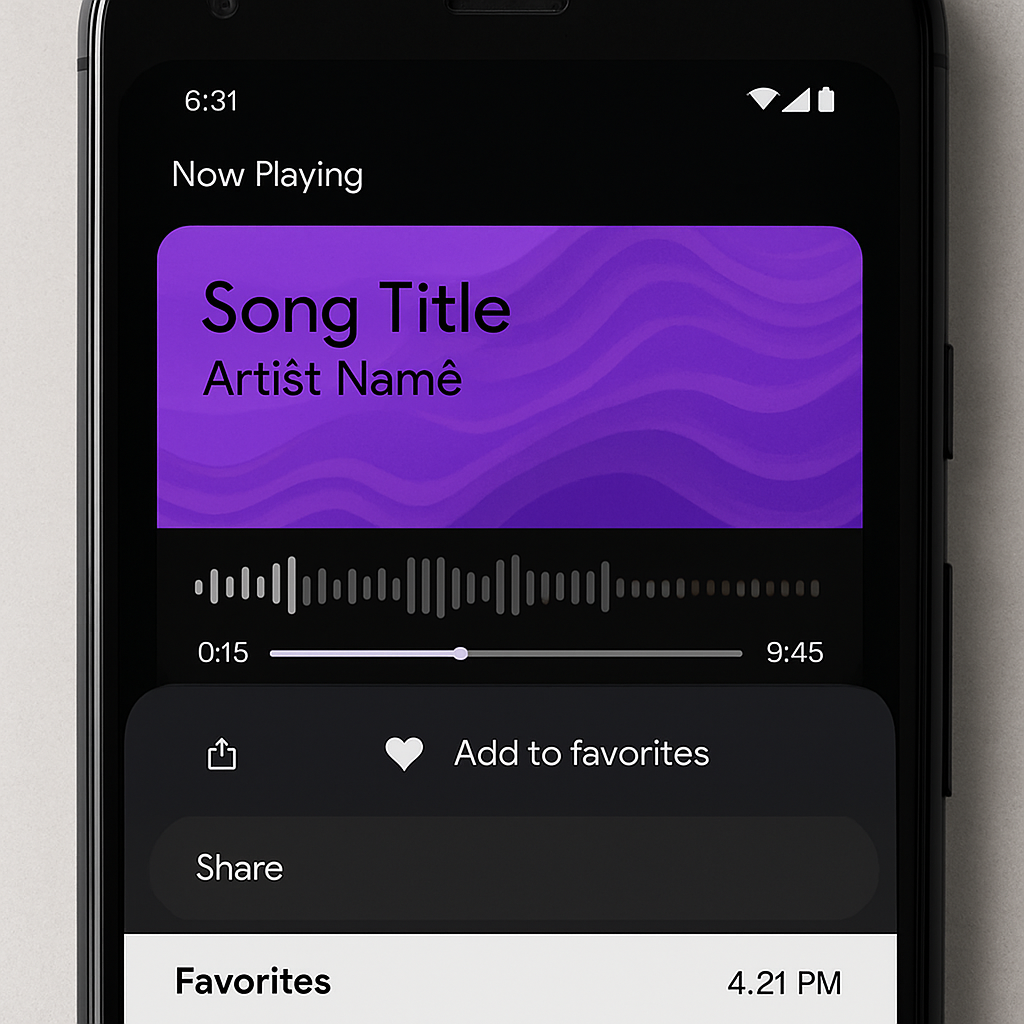
Instead of the old floating menu, Now Playing now uses a bottom sheet when accessing options via the three-dot button. This design allows track info and actions like Share, Add to Favorites, and Remove from History to appear side by side, with shortcuts to play the song or open it in your music app also presented clearly. The bottom sheet aims to improve usability—especially on larger Pixel devices—by making it easier to reach controls with one hand.
Favorites, Spacing, and Settings
The Favorites tab has been updated to show timestamps (dates and times), similar to what users already saw in the History feed. Additionally, small but meaningful adjustments have been made to icons, spacing, and layout in Now Playing’s Settings menu, refining the overall visual hierarchy and readability.
These changes build on previous updates: the “redesigned” Now Playing interface launched back in March, and in April the lock screen regained a “Tap to see what’s playing” shortcut. The latest version is now spreading widely via the Play Store, making these refinements accessible to more users.
Other recent Pixel updates include enhancements to Pixel Journal (adding new tools), new filter options for Screenshots, and fresh icons across apps like Calculator, Clock, Magnifier, Recorder, and Weather.
Why this matters: The tweaks to Now Playing might seem subtle, but they reflect a broader push toward smoother user experience on Pixel phones. By shifting to more accessible menu layouts, clearer navigation in tabs, and consistent visual design, Google is slowly but steadily fine-tuning how people interact with always-on, ambient features. What to watch: how users react to the bottom sheet in practice (especially in terms of reachability and discoverability), and whether these UI adjustments appear in other core features across Android or Pixel-exclusive tools.