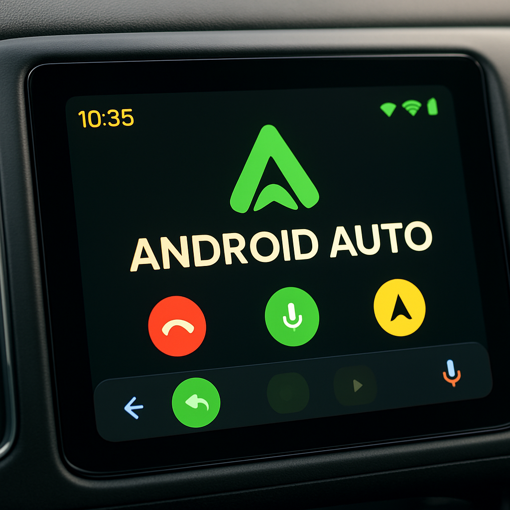
Google has begun rolling out Android Auto version 17.6, bringing a fresh visual update to its logo and interface. The update introduces a redesigned green Android Auto icon that replaces the long-standing blue one in some places. Alongside the icon change, subtle updates to the wordmark and accent colors have been applied to align with the new branding.
Logo & Branding Changes
In this release, the icon for Android Auto has transitioned from its blue variant to a green version. This new design has started appearing in specific areas such as the app switcher when accessing Android Auto settings, but it hasn’t fully replaced the previous icon everywhere—some notifications still show the blue version.
The official Android Auto website has also been quietly updated to reflect the change, including on a video thumbnail promoting integration with Gemini. The wordmark itself has been given a slight refresh to harmonize with the updated logo.
Where Users Will Notice the Changes
Users will encounter the green icon most consistently within Android Auto’s settings screen and in the app switcher. Other areas—like notifications—remain inconsistent, often showing the older blue icon. This suggests a gradual rollout rather than an immediate, system-wide swap.
Additionally, the settings menu has picked up a green accent color to match the updated iconography, reinforcing the new visual theme.
While Android Auto 17.6 doesn’t bring sweeping new features, the aesthetic changes point to a shift in Google’s branding strategy for its in-car software platform.
Why This Matters: The logo refresh underlines Android Auto’s ongoing evolution in how it presents itself visually. Branding is more than cosmetic—it tells users something about the product’s identity. Keeping your app’s appearance modern and consistent boosts recognition and trust, especially in environments where usability matters, like driving. Going forward, watch for when the green icon becomes fully standard across all notifications and interfaces, and whether this visual shift signals deeper design changes in Android Auto’s UI.