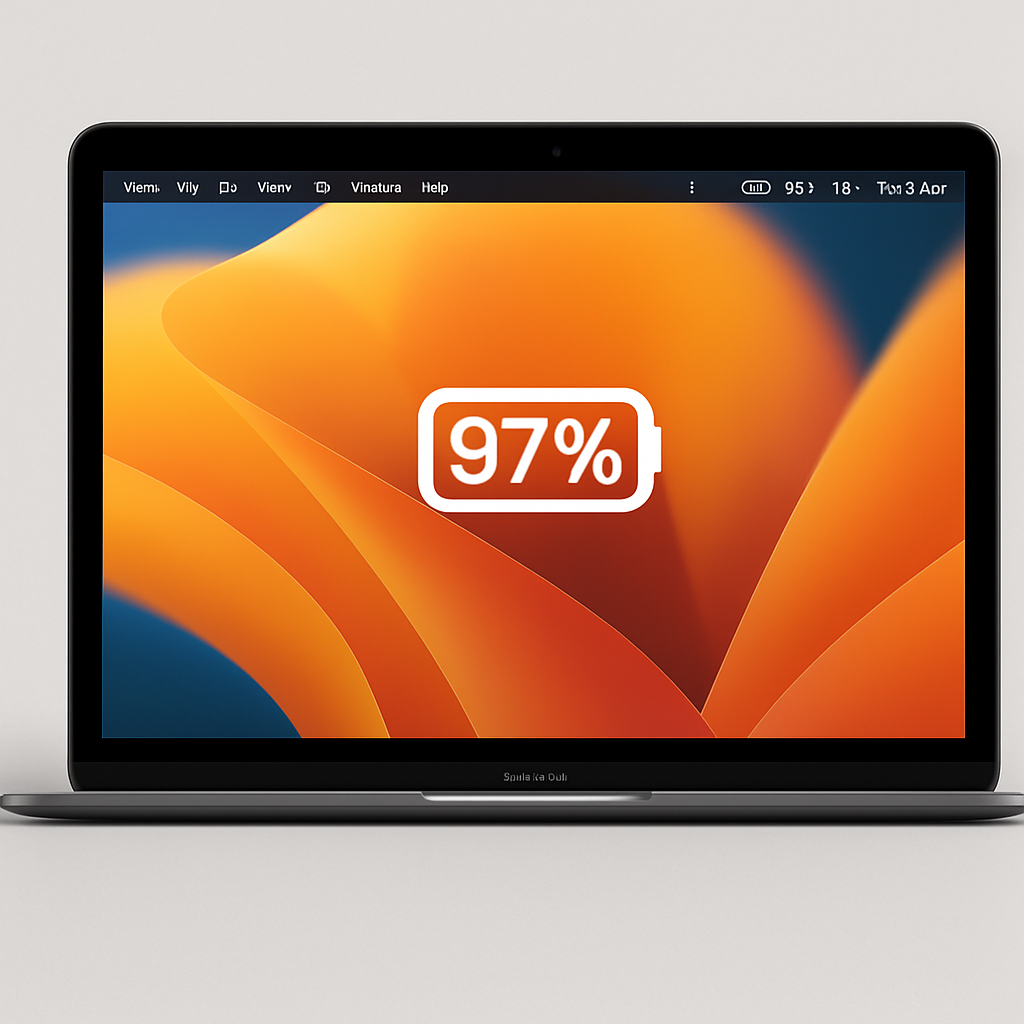
Apple’s latest operating system, macOS 27 Golden Gate, introduces a redesigned battery indicator in the menu bar that has sparked discussions among MacBook users. The new design defaults to displaying only a battery icon without the accompanying percentage, a departure from previous versions where users could opt to see the exact battery percentage alongside the icon.
For those who prefer to monitor their battery life more precisely, macOS 27 offers an option to display the percentage. However, this percentage is now placed inside the battery icon itself, mirroring the design approach taken in iOS 27 for iPhones. While this design choice may be suitable for devices with limited screen space, such as iPhones, its application on MacBooks has raised usability concerns.
Users have reported that embedding the percentage within the battery icon makes it less legible, especially on larger MacBook screens where space constraints are minimal. This change has led to a decrease in the immediate readability of battery status, which is crucial for users who rely on their MacBooks for extended periods without access to charging.
In response to these concerns, some users have turned to third-party solutions to restore the previous battery display format. For instance, a simple menu bar utility has been developed to present the current battery state and percentage with enhanced visual clarity, addressing the readability issues introduced by the new design.
While macOS 27 Golden Gate brings several enhancements and refinements to the Mac experience, this particular design decision highlights the importance of balancing aesthetic consistency across devices with practical usability considerations. As Apple continues to evolve its operating systems, it will be essential to ensure that design changes enhance user experience without compromising functionality.