Google Wallet Introduces Subtle Gradient Icon Redesign
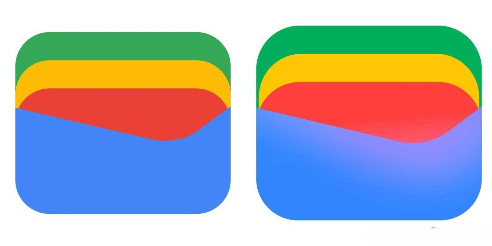
Google Wallet has recently updated its icon, incorporating a subtle gradient effect that adds a gentle glow to the design. While the overall rectangular shape remains consistent, the yellow card element has been slightly narrowed. More notably, the blue and red sections now feature a soft glow, enhancing the visual appeal.
This gradient effect is subtle and may be challenging to notice on smaller screens. In fact, it’s even more understated than the recent Google Photos icon update. Currently, this refreshed icon appears on the Google Wallet homepage in the top-left corner. However, as of version 26.19, the homescreen app icon itself has not yet been updated.
This icon update precedes a significant redesign of the passes feature within Google Wallet, which is not yet widely available and has not been officially announced. The upcoming redesign is expected to introduce a search function within the app, offering a notable improvement in user experience.
Google Wallet’s new gradient icon aligns with similar updates across other Google applications, including Search, Gemini, Home, Photos, and Maps. Additionally, a new icon for Google Health was recently spotted, and all Workspace icons are slated for a comprehensive revamp.
This trend reflects Google’s broader initiative to modernize its visual identity, emphasizing a cohesive and contemporary design language across its suite of applications.