Google Unveils Bold Gradient Redesigns for Gmail and Workspace Icons
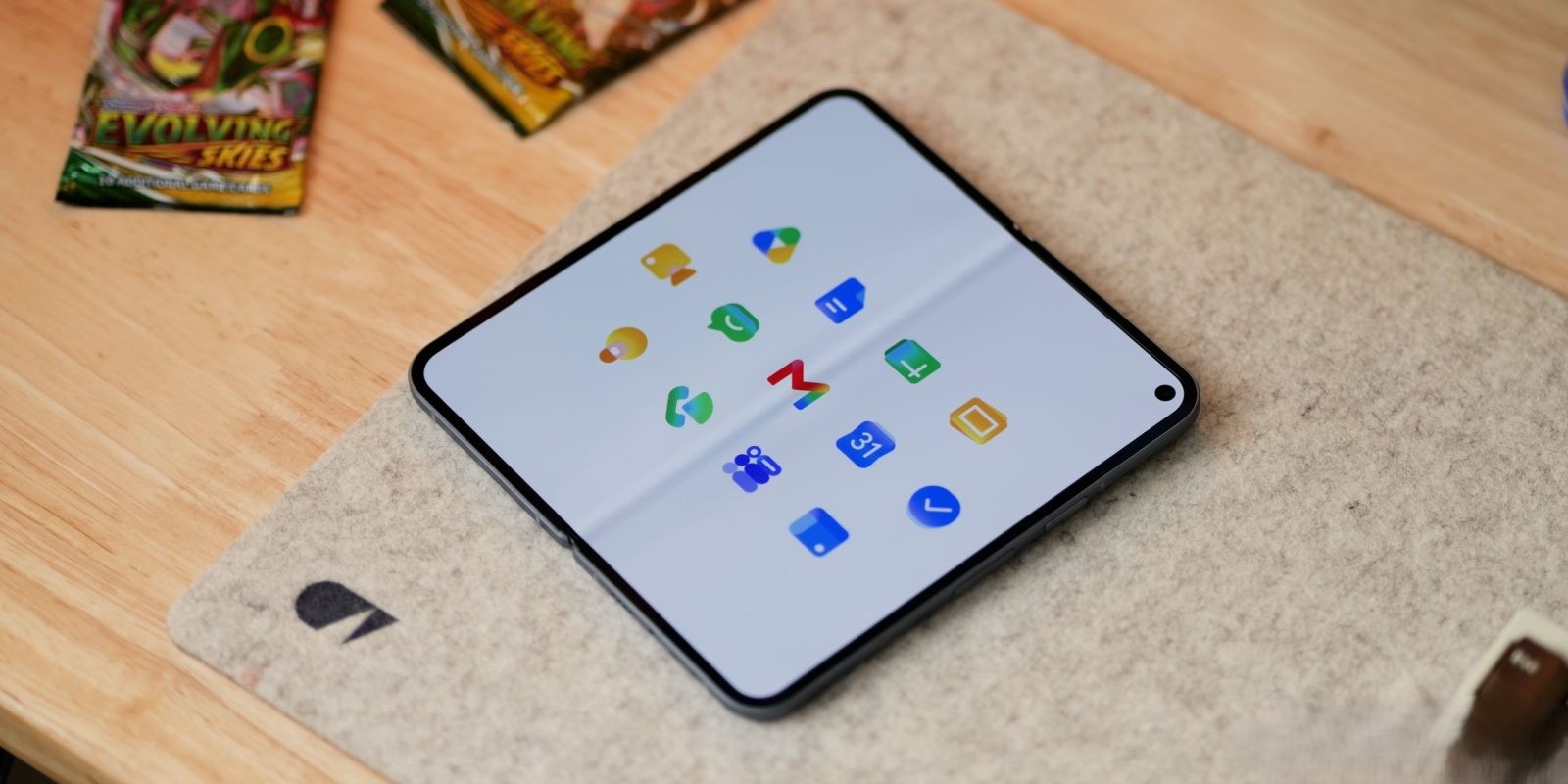
Google has embarked on a significant visual transformation of its Workspace suite, introducing gradient-based redesigns for icons across applications such as Gmail, Calendar, Drive, and others. This initiative aims to enhance distinctiveness and reflect the integration of AI-powered features within these tools.
Embracing Gradient Aesthetics
The new design language incorporates gradient effects previously seen in Google’s ‘G’ logo, Gemini, Home, Photos, and Maps. This cohesive approach signifies the company’s commitment to a unified visual identity that mirrors the evolving capabilities of its applications.
Distinctive and Unique Icons
Addressing past critiques, Google has moved away from the uniform inclusion of all four company colors in each icon. The removal of the page container allows for larger, more unique icons, enhancing user recognition and interaction.
Detailed Icon Redesigns
– Google Drive: The updated Drive icon omits red, focusing on green, yellow, and blue hues that align with the editor apps. The design features a rounded triangle exterior with a sharp center, offering a modern aesthetic.
– Google Docs, Sheets, Slides: Each editor app maintains a dominant color. Docs retains its vertical paper icon, while Sheets and Slides adopt landscape orientations, reflecting their functional layouts.
– Google Meet and Chat: Meet’s icon undergoes a significant change, presenting a video camera in a predominant yellow color. Chat’s icon features a green, pill-shaped message bubble with a friendly smile, possibly nodding to Hangouts.
– Gmail: The ‘M’ envelope shape becomes more rounded, with red as the primary color, accented by subtle yellow, green, and blue touches. This design choice enhances the icon’s uniqueness and recognizability.
– Google Calendar: The icon returns to a classic design reminiscent of a flip-style calendar, with the four-color exterior removed in favor of a traditional blue, evoking nostalgia.
– Google Tasks: Featuring a checkmark, the icon’s container is less defined, possibly representing a button for completed reminders. Blue serves as the primary color, aligning with Calendar.
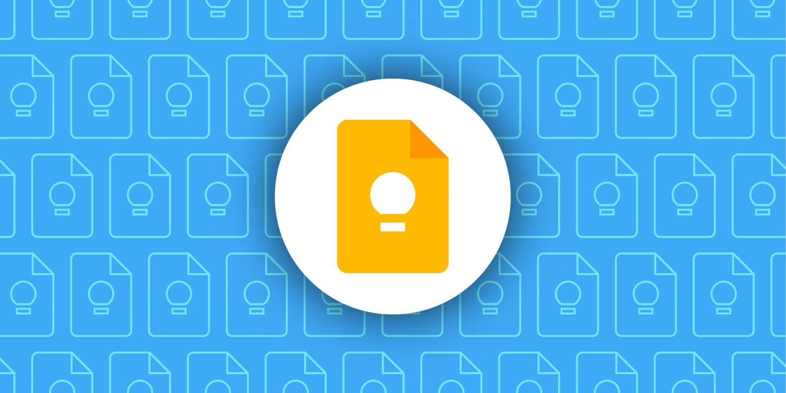
– Google Keep: The page background is removed, focusing on a detailed light bulb design.
– Google Voice: Retaining its shape, the icon becomes more rounded, with a light green color matching Google Chat, emphasizing its calling functionality.
– Google Forms and Sites: Forms shifts from a paper motif to multiple-choice bubbles, maintaining purple as the main color. Sites transitions to a lighter blue with a horizontal orientation, reflecting desktop web layouts.
Conclusion
Google’s comprehensive icon redesign introduces a gradient aesthetic that not only modernizes the visual appeal but also signifies the integration of AI features across its Workspace applications. By enhancing distinctiveness and embracing a unified design language, Google aims to improve user experience and brand coherence.