Apple’s New MacBook Keyboards Embrace Glyphs Over Text Labels
In a subtle yet significant design shift, Apple has updated the keyboards on its latest MacBook Air and MacBook Pro models by replacing traditional text labels with glyph symbols on several keys. This change, announced last week, affects the U.S. English keyboard layout and is expected to be immediately noticeable to regular MacBook users.
Key Changes in Keyboard Design
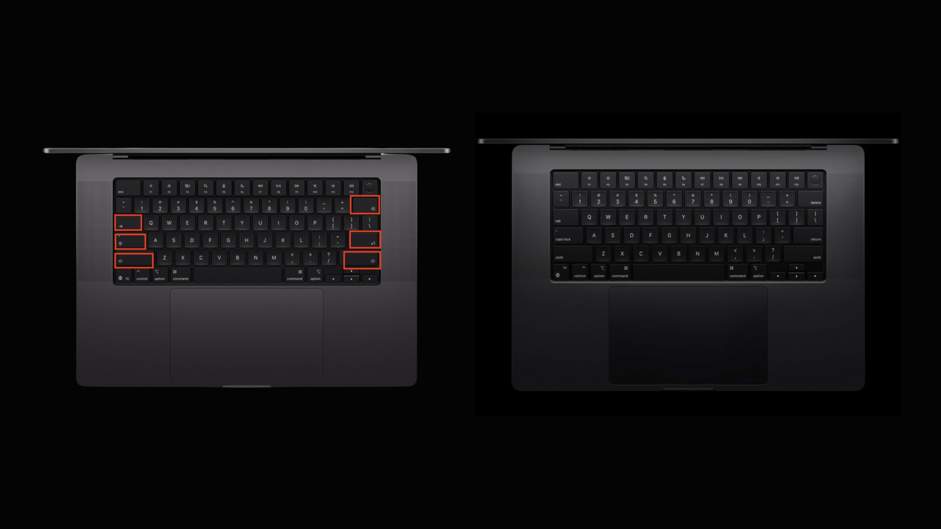
The updated keyboards now feature glyphs instead of text on the following keys:
– Tab: Previously labeled Tab, now represented by a left-pointing arrow with a vertical line at the end.
– Caps Lock: The text Caps Lock has been replaced with an upward-pointing arrow with a horizontal line beneath it.
– Shift: Formerly displaying Shift, this key now shows a simple upward-pointing arrow.
– Return: The Return label has been substituted with a left-pointing arrow that curves downward.
– Delete: Instead of Delete, the key now features a left-pointing arrow with an X inside.
This design approach aligns the U.S. keyboard layout with Apple’s European versions, which have long utilized glyphs for these keys. The consistency across regions reflects Apple’s commitment to a unified design language.
Rationale Behind the Change
Apple’s decision to adopt glyphs over text labels is likely driven by several factors:
1. International Consistency: By standardizing key symbols across different regions, Apple simplifies the manufacturing process and provides a cohesive user experience for international customers.
2. Aesthetic Minimalism: Glyphs contribute to a cleaner, more streamlined keyboard appearance, aligning with Apple’s minimalist design philosophy.
3. Space Efficiency: Symbols occupy less space than text, allowing for larger keycaps or more spacing between keys, potentially enhancing typing comfort.
User Adaptation and Potential Challenges
While the transition to glyphs may be intuitive for some users, others might face a learning curve, especially those accustomed to text labels. However, the symbols chosen are generally intuitive and widely recognized, which should ease the adaptation process.
It’s also worth noting that this change may affect users who rely on text labels for accessibility reasons. Apple has a history of prioritizing accessibility, so it’s possible that software updates or alternative solutions will be provided to assist these users.
Broader Implications for Apple’s Design Strategy
This keyboard update is part of a broader trend in Apple’s design evolution. For instance, the recent release of macOS 26 Tahoe introduced the Liquid Glass UI, emphasizing transparency and depth, and replaced the traditional Mickey Mouse hand cursor with a more anatomically accurate pointer. These changes indicate a shift towards a more modern and cohesive design language across Apple’s hardware and software.
Conclusion
Apple’s move to replace text labels with glyphs on its new MacBook keyboards reflects a commitment to design consistency and aesthetic refinement. While some users may need time to adjust, the change aligns with global standards and enhances the minimalist appeal of Apple’s products. As with any design evolution, user feedback will be crucial in determining the success and acceptance of this update.