Google has recently introduced a series of design updates to its suite of applications, notably Google Photos and Google Maps, enhancing user experience through visual refinements and functional improvements.
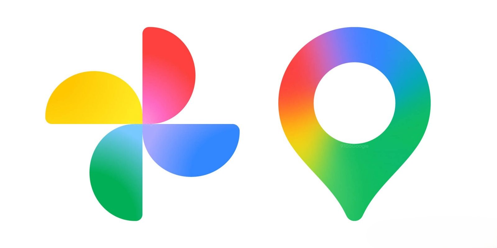
Google Photos: A Fresh Look and Enhanced Functionality
In September 2025, Google Photos unveiled a comprehensive redesign of its image editor on Android devices. This update introduced a reorganized carousel at the bottom of the screen, featuring a magnifying glass icon for tool search and a detailed list of editing options with descriptions. The tools are categorized into tabs such as Auto, Actions, Markup, Filters, Lighting, and Color, each offering a range of functionalities from basic adjustments to advanced AI-powered enhancements. Notably, the Auto tab includes features like Enhance, Dynamic, and AI Enhance, which utilize a combination of tools to generate multiple results. Additionally, users can now edit specific parts of a photo by tapping, drawing a circle, or brushing over the area, with options like Magic Eraser and Reimagine (Magic Editor) becoming more accessible. This redesign aims to streamline the editing process, making it more intuitive and efficient for users. ([9to5google.com](https://9to5google.com/2025/09/05/google-photos-editor-redesign-android/?utm_source=openai))
Further enhancing the user interface, Google Photos introduced a new photo view in July 2025. This update offers a simpler and more modern UI, with the background now matching the device’s system theme, available in both light and dark modes. At the top of each image, users can view glanceable date, time, and location details. Pill-shaped badges provide quick access to features such as changing the photo’s category, playing or pausing Live or Motion photos, saving shared photos to the library, and managing backups. Photo stacks and bursts are now more manageable, with options to change the top pick, keep selected photos, delete the rest, or unstack them. The actions menu has been streamlined for improved usability, with options like Share, Edit, and Trash readily accessible, while other functions are housed in an overflow menu. This redesign is widely available on iOS and is expected to roll out to Android devices soon. ([9to5google.com](https://9to5google.com/2025/07/01/google-photos-view-redesign/?utm_source=openai))
In August 2025, Google Photos also introduced a persistent backup indicator leveraging Material 3 Expressive design. The app now displays a spinning pinwheel icon that transitions into a Backup complete chip with a cloud icon. Tapping or dragging down on this indicator provides details on the number of photos backed up to the user’s account. During the backup process, the indicator shows statuses like Preparing backup and Backing up photos, accompanied by a wavy circular progress indicator. This prominent and persistent design ensures users are always aware of their backup status, emphasizing the importance of cloud backups for their photos. ([9to5google.com](https://9to5google.com/2025/08/05/google-photos-backup-redesign/?utm_source=openai))
Google Maps: Visual Refinements and Functional Enhancements
Google Maps has also undergone several design updates to improve user experience. In June 2025, the app updated the logo that appears in the bottom-left corner of the map layer. Previously, this spot featured the four-color Google logo with a white border. The new design replaces it with Google Maps text in black or white, depending on the system or device theme. This change aims to provide a less distracting and more cohesive branding within the app. The update has been widely rolled out on Android and iOS platforms. ([9to5google.com](https://9to5google.com/2025/06/01/google-maps-corner-logo/?utm_source=openai))
In August 2024, Google Maps introduced a redesign of its pins, opting for a shorter and more rounded shape with a white background. The category icon is now housed in an inner circle, matching the existing design for stars, flags, and hearts. Some pins have also changed colors; for example, the icon for museums is now purple instead of teal. This redesign aims to make the pins less prominent, allowing more information to be displayed per map view, and follows Google’s previous updates to the main map colors. ([9to5google.com](https://9to5google.com/2024/08/27/google-maps-pin-redesign/?utm_source=openai))
In December 2024, Google Maps began rolling out a new teal accent color for buttons and other UI elements, replacing the previous blue accent. This change is part of a broader effort to refresh the app’s appearance and provide a more modern and cohesive look. The teal accent is applied to various elements, including the bottom bar and icons for directions and location. This update has been introduced on both Android and iOS platforms. ([9to5google.com](https://9to5google.com/2024/12/12/google-maps-teal-color/?utm_source=openai))
Additionally, in January 2024, Google Maps elevated its augmented reality (AR) navigation and discovery capability by integrating Google Lens branding. The app now features a more prominent Google Lens icon in the search bar, encouraging users to utilize AR features for navigation and local discovery. This integration aims to enhance the user experience by providing more intuitive and interactive navigation options. ([9to5google.com](https://9to5google.com/2024/01/19/google-maps-lens/?utm_source=openai))
Conclusion
These design updates across Google Photos and Google Maps reflect Google’s commitment to enhancing user experience through visual refinements and functional improvements. By introducing more intuitive interfaces, streamlined functionalities, and cohesive design elements, Google aims to provide users with more efficient and enjoyable interactions with its applications.