In August 2025, Google Drive introduced a significant redesign aligned with the Material 3 Expressive (M3E) design language. This update featured a prominent search app bar, a unified container for file listings, and a connected button group for toggling between list and grid views. The design emphasized rounded corners and a cohesive visual structure, aiming to enhance user experience.
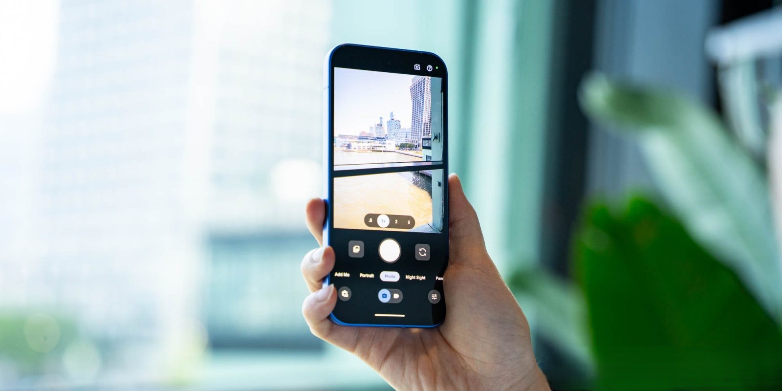
However, recent observations indicate a subtle yet notable shift in this design approach. The previously unified container that encompassed the entire list view has been removed. Now, each file or folder entry spans the full width of the screen, reminiscent of the pre-M3E design. This change reintroduces a more traditional, edge-to-edge layout, moving away from the containerized format.
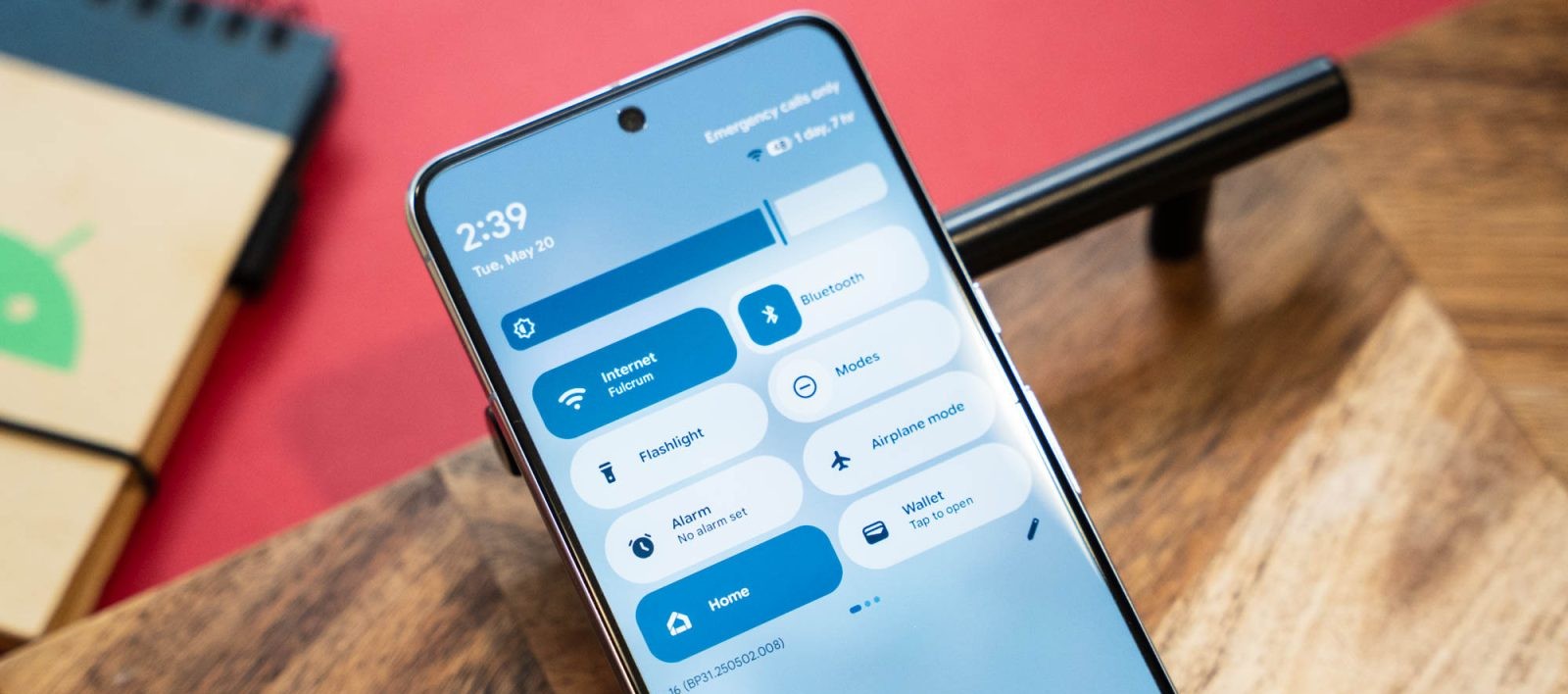
Additionally, the search app bar and bottom navigation bar have reverted to being separate entities. In the initial M3E design, these elements shared a connected background surface, creating a seamless visual flow. The current design reinstates distinct containers for these components, providing clearer separation between functional areas.
It’s important to note that other M3E elements remain intact. The floating action button (FAB) menu, button groups, and the compact bottom bar continue to reflect the M3E design principles. This selective adjustment suggests a nuanced approach to balancing modern design aesthetics with user familiarity and functionality.
The reasons behind this design modification are not explicitly stated. It could be a response to user feedback, aiming to address usability concerns or preferences. Alternatively, it might be an iterative refinement as Google continues to evolve its design language. There’s also the possibility that this change is temporary or a result of a software glitch, though its consistent appearance across devices and accounts suggests intentionality.
This development underscores the dynamic nature of user interface design. While the M3E design introduced a fresh, modern look, the reversion to certain traditional elements highlights the importance of user comfort and practicality. Design is not static; it evolves in response to user needs, technological advancements, and aesthetic trends.
For users, this change may offer a more familiar navigation experience, potentially reducing the learning curve associated with new design paradigms. The edge-to-edge layout can also provide a cleaner, more streamlined appearance, which some users might prefer over the containerized format.
In the broader context, this adjustment reflects a trend in software design where user feedback and real-world usage inform ongoing refinements. It highlights the balance between innovation and usability, ensuring that new designs enhance rather than hinder the user experience.
As Google continues to refine its applications, users can anticipate further updates that aim to harmonize modern design principles with practical functionality. Staying attuned to these changes can help users adapt and make the most of the evolving digital tools at their disposal.