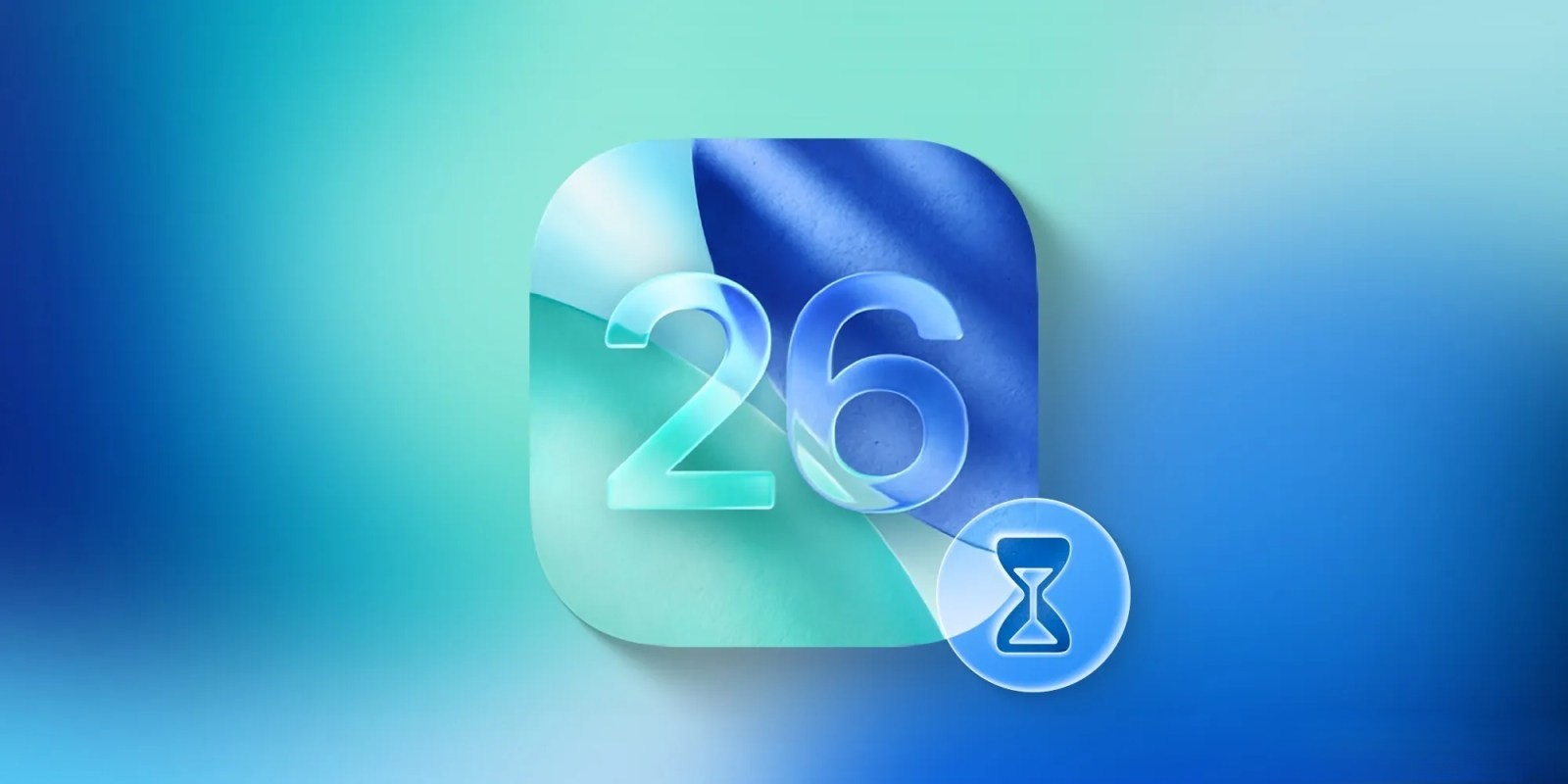
Apple has officially released iOS 26 today, introducing the much-anticipated Liquid Glass design. This update marks a significant visual overhaul, reminiscent of the shift seen with iOS 7 in 2013. However, the new design has sparked debate among developers and users alike.
The ‘Liquid Glass’ Aesthetic
The Liquid Glass design aims to create a more immersive and dynamic user interface by incorporating translucent elements that react to motion and content. Apple describes this as utilizing the optical qualities of glass, including refraction, to enhance the visual experience. This design philosophy is consistent across all Apple platforms, including macOS Tahoe 26 and watchOS 26. ([techradar.com](https://www.techradar.com/phones/ios/ios-26?utm_source=openai))
Developer Feedback and Concerns
Despite Apple’s intentions, several developers have expressed reservations about the new design. Craig Grannell from Wired notes that instead of sharpening focus, the design often muddies it due to legibility issues and distracting visual effects. He points out that on the Mac, controls are overly prominent, while on the iPhone, they tend to disappear into new menu structures, hindering the development of effective muscle memory.
Jonas Downey, designer of Hello Weather, acknowledges some positive aspects but feels that the new interfaces are complicated and intrusive. He highlights issues such as translucent components causing distraction, low contrast making element differentiation difficult, and excessive shading on buttons and tabs that overshadow the content beneath them. This, he argues, results in friction rather than focus.
Ben McCarthy, creator of Obscura Camera, appreciates Apple’s goal to blend interface and content to reduce distraction but believes that Liquid Glass achieves the opposite. He mentions that the design creates distortions that catch the eye as content scrolls, leading to fundamental legibility issues. The system’s attempts to adapt by flipping between light and dark modes to stay readable only add to the distraction.
Former Apple employee and Héliographe developer Guillaume Ardaud observes tensions between the stated goals of separating interface and content layers and the reality of elements partially obscuring content. He notes that this creates a swirl of distracting, constantly shifting colors as users scroll.
User Reactions and Adoption
Early adopters have reported mixed experiences. Some users appreciate the fresh aesthetic and dynamic elements, while others find the changes disorienting. Common complaints include difficulty in reading text due to low contrast and the distracting nature of the translucent elements.
A user named Lucas commented, I’ve been running it on my iPhone and tablet, and there are a bunch of consistency issues; many things look unfinished… to me, it needs more work and refinement.
Apple’s Response and Future Updates
Apple has acknowledged the feedback and is reportedly working on updates to address these concerns. The company emphasizes that Liquid Glass is a work in progress and that user feedback is crucial for refining the design. Future updates are expected to focus on improving legibility, reducing distractions, and enhancing overall user experience.
Compatibility and Installation
iOS 26 is compatible with iPhone 11 and newer models, as well as the 2nd-generation iPhone SE and later. To install the update, users can navigate to Settings > General > Software Update on their devices. ([axios.com](https://www.axios.com/2025/09/15/ios-26-download-apple-software-release?utm_source=openai))
Conclusion
The launch of iOS 26 with its Liquid Glass design represents a bold step by Apple to redefine the user interface across its platforms. While the new aesthetic has garnered both praise and criticism, it underscores Apple’s commitment to innovation. As with any major design overhaul, it will take time for users and developers to adapt, and for Apple to refine the experience based on feedback.


