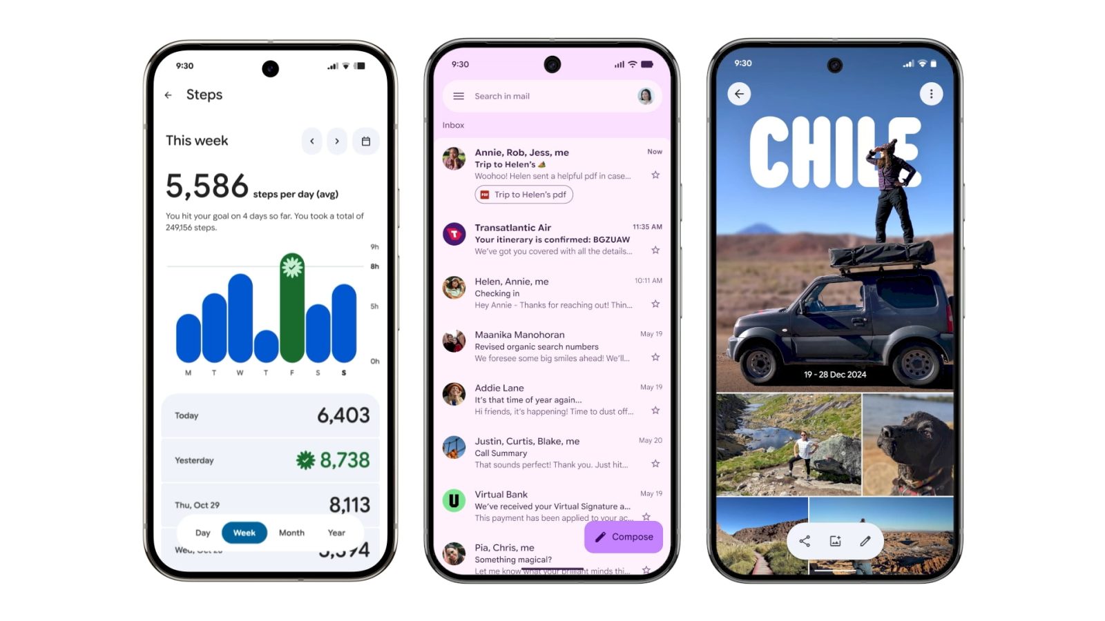
In May 2025, Google unveiled its latest design language, Material 3 Expressive (M3E), aiming to infuse its applications with more emotion, engagement, and user-friendly interfaces. Since the announcement, a series of Google apps have undergone significant redesigns to align with this new aesthetic. This article provides an in-depth look at the M3E updates across various Google applications, highlighting the changes and enhancements that users can expect.
Rolling Out
Pixel Recorder
The Pixel Recorder app has been streamlined to offer a more intuitive user experience. The recording interface has been simplified, with most actions now accessible through an overflow sheet, reducing on-screen clutter and making navigation more straightforward.
Pixel Weather
The Pixel Weather app’s homepage has been revamped to display larger city cards. While the number of visible locations has decreased from ten to six, each card now includes high and low temperature forecasts. Additionally, the city view has received minor tweaks, and native home screen widgets have been introduced for quicker access to weather information.
Pixel Buds
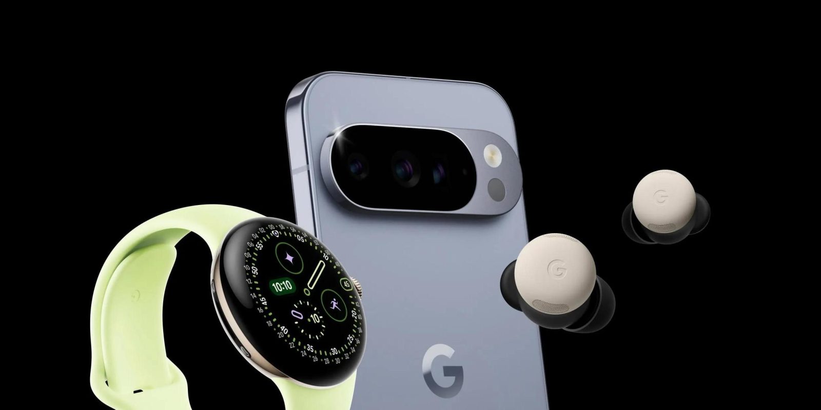
Significant updates have been made to the Pixel Buds app, particularly in the Equalizer section and gesture customization options. These enhancements provide users with more control over their audio experience and device interactions.
Google Clock
Version 8.1 of the Google Clock app introduces a shorter bottom navigation bar and a new font, contributing to a cleaner interface. The floating action button (FAB) has been redesigned into a rounded square and repositioned to the right for improved accessibility.
Google Calculator
In version 9.0, the Google Calculator app has hidden the row of scientific functions by default, decluttering the interface. A new history button has been added, allowing users to easily access previous calculations.
Google Drive
The Google Drive app now features a search app bar, with the list/grid content view placed within a large container. A connected button group has been introduced to switch between list and grid views seamlessly.
Gmail
Gmail’s interface has been updated to place email lists and messages within containers, enhancing visual organization. A prominent pill-shaped animation has been added to swipe gestures, providing a more dynamic user experience. The search app bar has been thickened, with the hamburger menu and profile switcher moved outside the search field for better accessibility.
Google Wallet
The Google Wallet app has replaced the Wallet text with the app logo in the top-left corner. Passes below the carousel now appear as thicker cards, and the Recent Activity page has been updated with containers for a more cohesive look. The NFC tap-to-pay animation has been enhanced with a translucent background and a more animated success indicator. Pixel users will also notice a new overlay when using the double-tap power button gesture.
Digital Wellbeing
The main page of Digital Wellbeing within the Settings app has been updated to include containers, and the donut graph has been thickened for better visibility. This update is rolling out with beta version 1.30.x.
Google One
The Google One app now features a shorter bottom bar, with cards and settings placed in more prominent containers. Infographics have been removed, resulting in a denser, more information-focused interface.
Google Messages
The Google Messages app has undergone several M3E updates:
– Search Page: The 2×4 grid for categories like Unread, Known, Unknown, Starred, Images, Videos, Places, and Links has been enlarged for better readability.
– Start Chat: Each contact is now placed in a container. When creating a group conversation, selecting a person morphs the rounded rectangle into a pill shape.
– Settings: Each line item is now within a container, and modern M3 on/off toggles have been implemented.
– Details Page: Similar to Google Contacts, the Call, Video, Contact Info, and Search buttons are now placed in pill-shaped containers.
Launched
Google TV
The Google TV app has been updated to align with the M3E design language, offering a more immersive and user-friendly interface.
Google Keep
Google Keep has widely rolled out its M3E redesign, featuring a thicker search app bar with Google Keep transitioning to Search Keep upon interaction. The navigation drawer remains unchanged, but the search interface now includes pill-shaped icons. The corner FAB has been tweaked to display the icon for Audio, Image, Drawing, List, or Text first. Notes now feature pin, reminders, and archive buttons placed in rounded squares in the top-right corner, with additional options like color/background and formatting in circles at the bottom.
Phone by Google
The Phone by Google app has undergone a comprehensive overhaul:
– Navigation: The bottom bar has been reduced from four tabs to three, with Favorites and Recents merged into Home. A new Keypad tab replaces the FAB, while Voicemail remains unchanged. Contacts are now accessible via a navigation drawer.
– Interface: Calls and lists, including settings, are now placed within containers. Incoming and in-call screens feature updated buttons with larger touch targets, offering options for horizontal swipe or single-tap interactions.
Google Photos
Google Photos has introduced a new backup indicator at the top of the app, replacing the Google Photos text. Upon launch, a logo animates into Backup complete. Pulling down to refresh reveals cycling M3E shapes on a background layer that also notes cloud storage usage. During backups, a wavy progress indicator is displayed.
Google Password Manager
The Google Password Manager has been updated to reflect the M3E design language, providing a more cohesive and user-friendly experience.
Google Calendar
Google Calendar’s M3E redesign places time slots (hours and days) within rounded containers across various views (Day, Week, Month), replacing the faint lines used previously. A solid background layer in the primary Dynamic Color has been added for better visibility. In the Month view, days are physically separated with rounded corners, and longer day abbreviations are now used, offering a more modern appearance.
Find Hub
The Find Hub app has been updated to align with the M3E design language, enhancing the user experience with a more intuitive interface.
Files by Google
Files by Google has received an M3E update, featuring a cleaner and more organized interface that improves file management and navigation.
Google Contacts
The Google Contacts app has been redesigned to place all elements within containers, with a shorter bottom bar and color tweaks to the app’s background, resulting in a more streamlined interface.
Google Docs, Sheets, and Slides
The editor interfaces of Google Docs, Sheets, and Slides have been updated with M3E elements:
– Progress Indicator: A new circular component with a wavy shape is displayed while waiting for documents to load.
– Buttons: Pill-shaped buttons themed with Dynamic Color are used for actions like sharing and indicating when editing is complete.
– Format Sheet: The sliding format sheet now features pill-shaped dropdown menus instead of rounded rectangles.
– Split Button Component: Used for bulleted and numbered lists, with the separate menu button spinning upon activation.
Google Meet
Google Meet’s M3E redesign includes:
– Homepage: Each call is placed in a large, tall card, emphasizing the use of containers.
– Pre-Call Screen: Voice and video call buttons have been significantly enlarged, providing larger touch targets. The name, picture, and email address of the person being called are centered at the top within a pill-shaped container. Various buttons have transitioned from circles to rounded squares.
Conclusion
Google’s Material 3 Expressive redesign represents a significant shift towards more engaging, intuitive, and user-friendly interfaces across its suite of applications. By incorporating elements like containers, dynamic colors, and simplified navigation, Google aims to enhance the overall user experience, making its apps more cohesive and visually appealing. As these updates continue to roll out, users can look forward to a more unified and expressive design language across their favorite Google apps.


