Apple’s iOS interface has long been characterized by its distinctive app icon shape known as the “squircle”—a square with rounded corners. This design choice, rooted in the mathematical concept of the superellipse, offers a harmonious blend between a square and a circle, providing a unique aesthetic that has become synonymous with Apple’s design language.
The squircle’s appeal lies in its smooth transitions and continuity of curvature, which contribute to a natural and cohesive visual experience. This design principle extends beyond app icons, influencing the overall hardware and software aesthetics of Apple’s products. The superellipse shape, popularized by Danish scientist Piet Hein, has been integral to Apple’s design philosophy, ensuring that elements like app icons, device corners, and even the architecture of Apple’s campus exhibit a consistent and organic form.
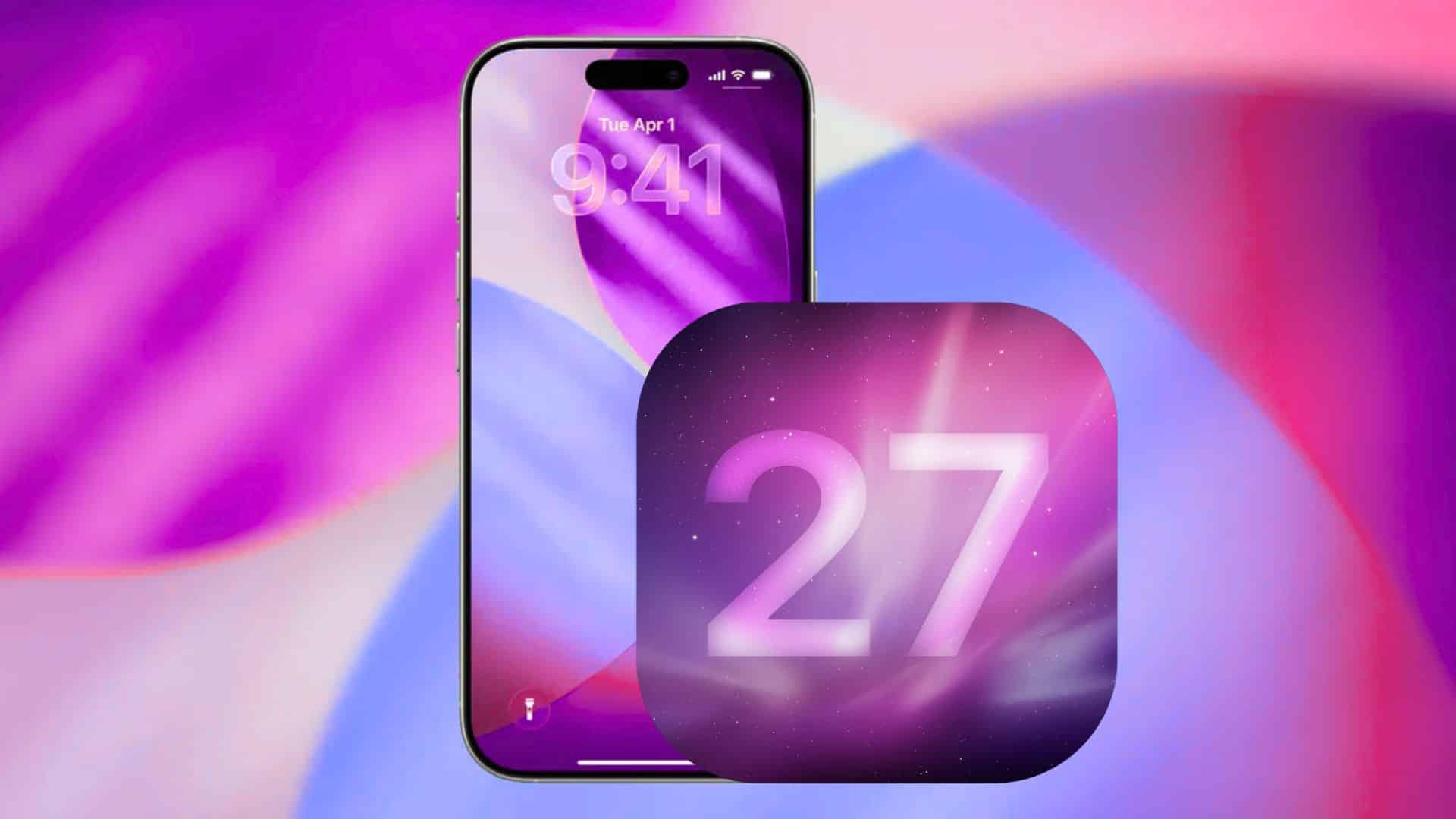
However, recent discussions within the tech community suggest that Apple may be considering a shift from squircles to circular app icons in the upcoming iOS 19. This potential change has sparked debates among designers and users alike, as it could have significant implications for app icon design and the overall user interface.
Understanding the Squircle and Its Significance
The squircle is not merely a design whim; it is a deliberate choice that enhances the visual harmony of the iOS interface. By employing a superellipse equation, Apple achieves a shape that balances the rigidity of a square with the softness of a circle. This balance ensures that app icons are neither too sharp nor too rounded, providing a comfortable and aesthetically pleasing appearance.
The continuity of curvature in squircles allows for smooth transitions between the edges and the center of the icon, which is crucial for maintaining a cohesive look across various interface elements. This design choice also reflects in Apple’s hardware, where devices like the iPhone, iPad, and MacBook feature rounded corners that echo the squircle shape, reinforcing the brand’s commitment to design consistency.
Potential Shift to Circular Icons in iOS 19
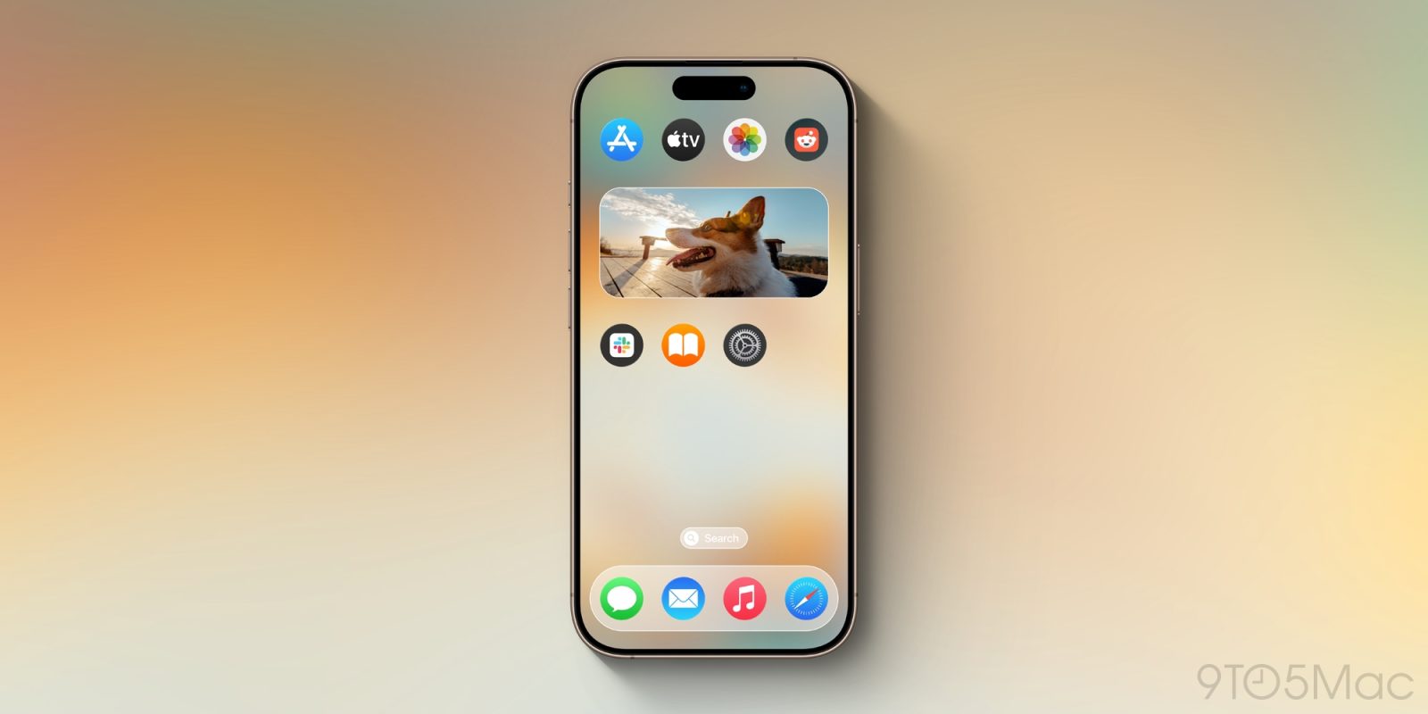
Speculation about Apple’s move to circular app icons in iOS 19 has raised several considerations. While circles are a common geometric shape, their implementation in app icon design presents unique challenges. For instance, many existing app icons are designed with the squircle’s proportions in mind, utilizing the available space to display logos, symbols, or imagery effectively.
Transitioning to a circular format would require designers to rethink their iconography to fit within a new spatial constraint. Icons with square or rectangular elements may need to be resized or redesigned to avoid being cropped or appearing disproportionate within a circular boundary. This shift could lead to a significant redesign effort for developers and designers to ensure that their app icons remain recognizable and visually appealing.
Design Implications and Challenges
The move from squircles to circles is not merely a cosmetic change; it carries substantial design implications. One of the primary challenges is maintaining visual consistency across the iOS ecosystem. Apple’s current design guidelines encourage the use of the squircle shape, and a sudden shift to circles would necessitate a comprehensive update to these guidelines.
Moreover, the circular shape may not accommodate certain design elements as effectively as the squircle. For example, app icons that incorporate text, intricate patterns, or rectangular imagery might face difficulties in adapting to a circular format without compromising their design integrity. This could lead to a homogenization of app icons, where unique design elements are sacrificed for the sake of conformity to the new shape.
Additionally, the transition could impact user experience. Users have grown accustomed to the squircle design, and a sudden change to circles might disrupt their visual familiarity with the interface. This disruption could affect the ease with which users identify and interact with apps, potentially leading to a learning curve as they adjust to the new iconography.
Historical Context and Precedents
Apple’s design evolution has seen several significant changes over the years. For instance, the introduction of iOS 7 marked a departure from skeuomorphic design to a flatter, more minimalist aesthetic. This shift was accompanied by changes in app icon design, including the adoption of the squircle shape. The decision to use squircles was not arbitrary; it was a calculated move to create a more modern and cohesive visual language.
The potential shift to circular icons in iOS 19 could be seen as a continuation of Apple’s willingness to evolve its design principles. However, such a change would need to be carefully considered to ensure that it aligns with the company’s overarching design philosophy and does not compromise the user experience.
Community Reactions and Speculations
The tech community’s response to the rumored change has been mixed. Some designers welcome the potential for a refreshed look, viewing it as an opportunity to innovate and experiment with new design concepts. Others express concern about the practical challenges of adapting existing icons to a circular format and the potential loss of design diversity.
Discussions on platforms like Stack Overflow highlight the technical constraints associated with changing app icon shapes. For instance, a query about altering app icon layouts in iOS reveals that Apple’s guidelines require icons to be in PNG format without transparent regions, indicating that deviations from the standard shape are not straightforward. This underscores the importance of adhering to Apple’s design standards to ensure compatibility and consistency across the platform.
Conclusion
The potential transition from squircles to circles in iOS 19 app icons represents a significant design shift with far-reaching implications. While it offers an opportunity for visual refreshment, it also poses challenges related to design adaptation, user experience, and consistency within the iOS ecosystem. As Apple continues to innovate, it will be crucial to balance aesthetic evolution with practical considerations to maintain the integrity and usability of its interface.